Matrix questions - create a stacked graph of responses in Excel
We have been asked about how to display the responses to a matrix question in a stacked graph, and the following article explains how to go about this using Excel.
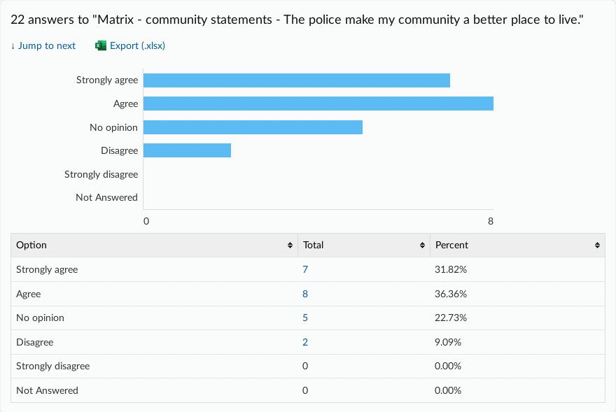
To start, you may have a matrix question like the below. This particular one uses a Likert scale (Strongly agree to Strongly disagree), to gauge respondent's feelings

If you were to look at the responses to this question in the 'Responses organised by question' section of your dashboard, you will see that Citizen Space provides each statement with its own chart of responses.
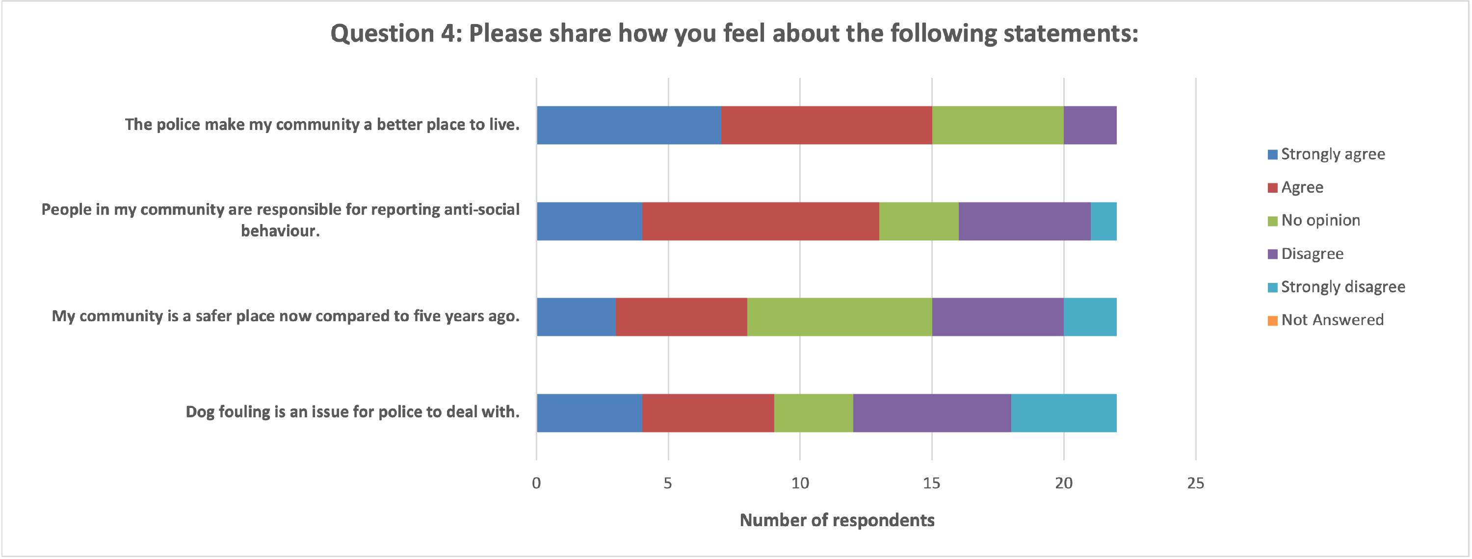
What you might now want is to be able to create a single graph for this question with all statements and the various answer options stacked against one another.
How to create a stacked graph in Excel
The first stage is to get your data in correctly, and thankfully this is a simple copy and paste job from a downloaded .xlsx file.
How you need to organise your data in Excel

- Get your scale of options in as row headers on Column A.
- Put your statements in a single row as column headers, starting with Column B.
Now we'll get Excel to do the work for you
Make Excel turn that into a chart
- Highlight/select your data as if you were going to copy it. This tells Excel what data you want to make a chart from.
- Go to Insert Tab > Charts > See all Charts > Select and insert the desired chart.
- In this case, go to Bar chart > Stacked Bar.
4. Boom! This should have automatically created a chart from your data.

You may need to refine the chart — see more detailed guidance from Acuity Training on how to create stacked bar and column charts.
And that's it - you now have a stacked chart of your matrix question data.