Analysis - Response Organised by Question charts
In this article, we'll be looking at:
Charts of responses by question
Citizen Space includes the ability to generate charts of user responses, making them easier to visualise when analysing results. If you are not familiar with the 'Responses organised by Question' feature, then this article will provide a bit more info. Once you have queried the data, a visual overview of your results will be displayed:
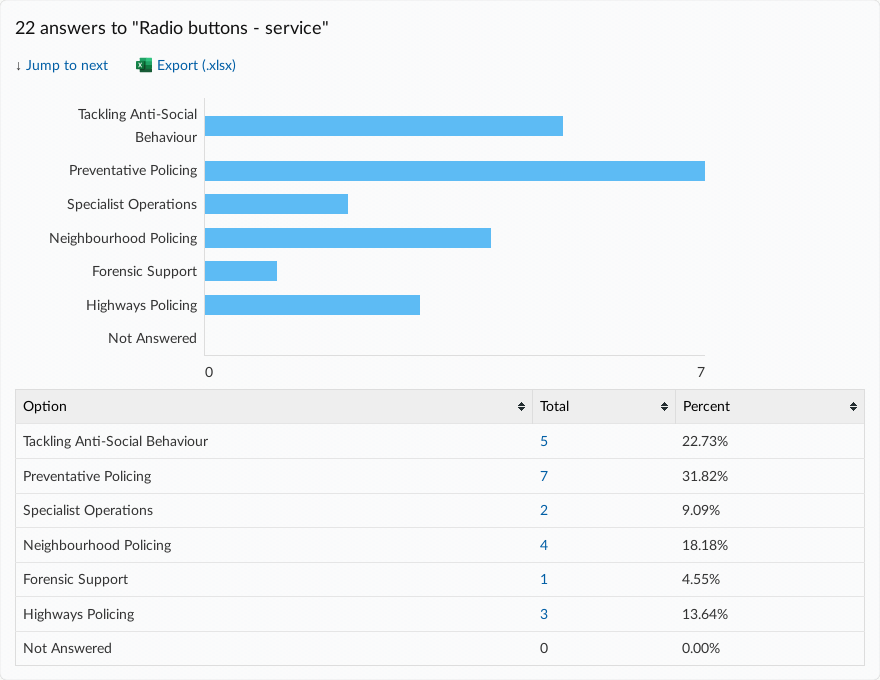
The charts allow easy visualisation of quantitative survey responses, as well as a table with percentages and totals. If you hover your cursor over a response, it and the according element of the table below, will turn yellow. By selecting it, you will apply a filter that shows you the list of respondents who chose that answer.

Charts for qualitative responses
With a small amount of extra input from an analyst, similar charts can be obtained on qualitative answers, by adding tags to your qualitative responses. For example, in the screenshot below, an analyst has added tags to the qualitative responses in the question 'how much do you pay on gas bills a year?'. This groups these into a series of ranges, allowing them to be visualised in the chart below. For more information about using tags, see 'how do I tag responses'?

Charts for grouped responses
The charts will also reflect grouped responses by displaying them in different colours, as you can see below. This can help you to cross-reference the answers to different survey questions during your analysis. To find out more about grouping responses, you can read our article, 'How do I use Filtering and Grouping of responses?'.

It is possible to include or exclude 'not answered' from the charts or graphs, which you can read more about in our article detailing that option.