.png)
Image choice answer components
In this article we’ll be looking at the image choice answer component regarding:
- What it is used for
- Things to know
- Adding or editing an image choice component
- Reporting and analysis for the image choice answer component
What is the component used for?
Image choice is a multiple choice answer component, either as a radio (single answer) or checkbox (all that apply) option, that allows you to present an image as an answer option.

Things to know
- The value in the 'Answer' field is what is stored in the dataset and displayed throughout the reports and exports.
- Image file types allowed: png and jpeg images
- Filtering, reporting and exports just use the text answer and act exactly as for current radio/checkboxes (no image included included in these reports). However, response PDFs do show the image.
- You can add up to 10 image answer options.
Note: When using a mobile device, there is less of a difference between the small and large image size options to allow enough room for the display text.
How to add or edit an image choice answer component
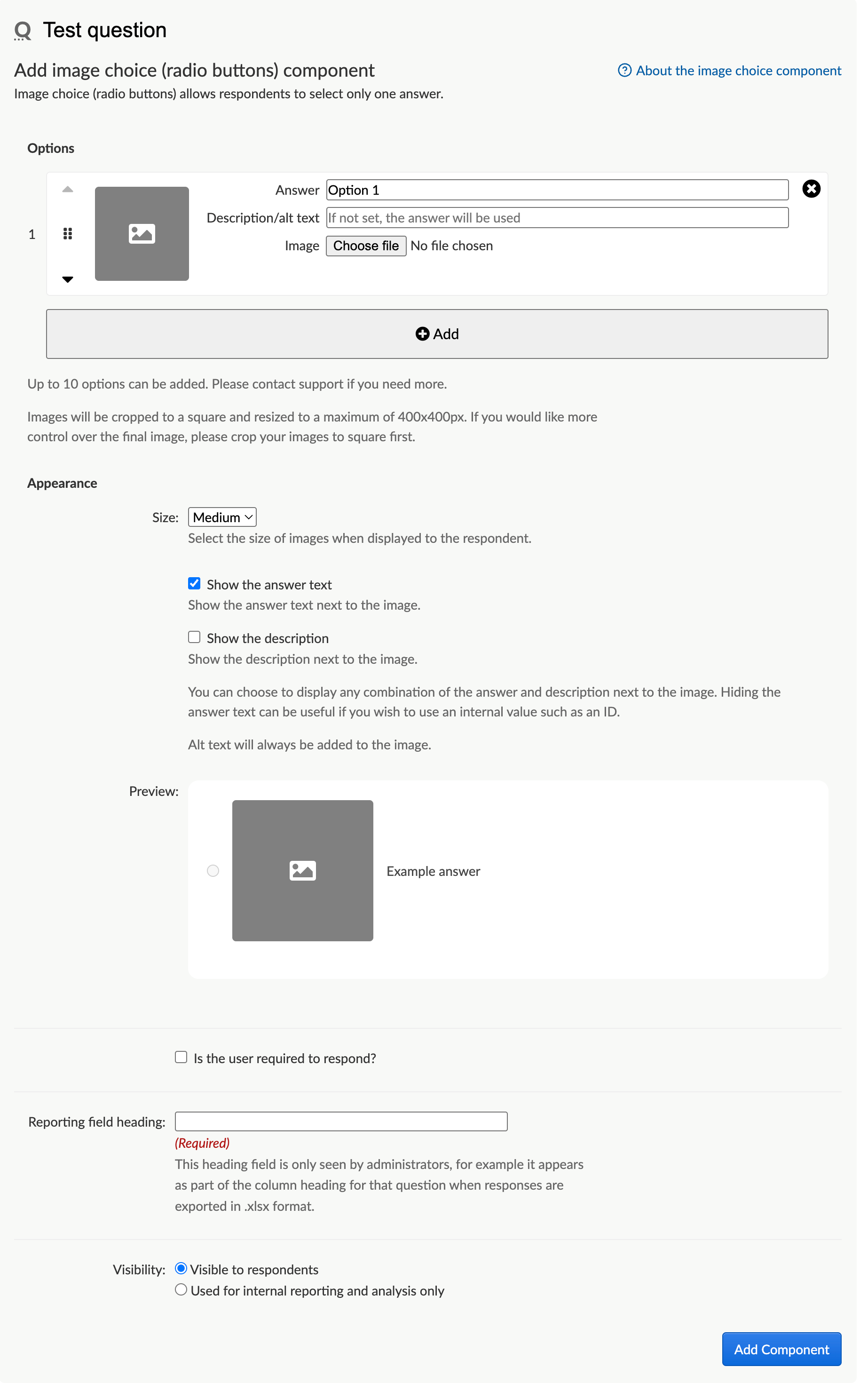
To add an image choice answer component to a question, select the question title in the 'Build Activity' sidebar. From the dropdown list of answer components, select either 'Image choice - radio buttons (select one answer)' or 'Image choice - checkboxes (select all that apply)', then select 'Add Answer Component'.
The Add or Edit form for an image choice answer component consists of the following sections:
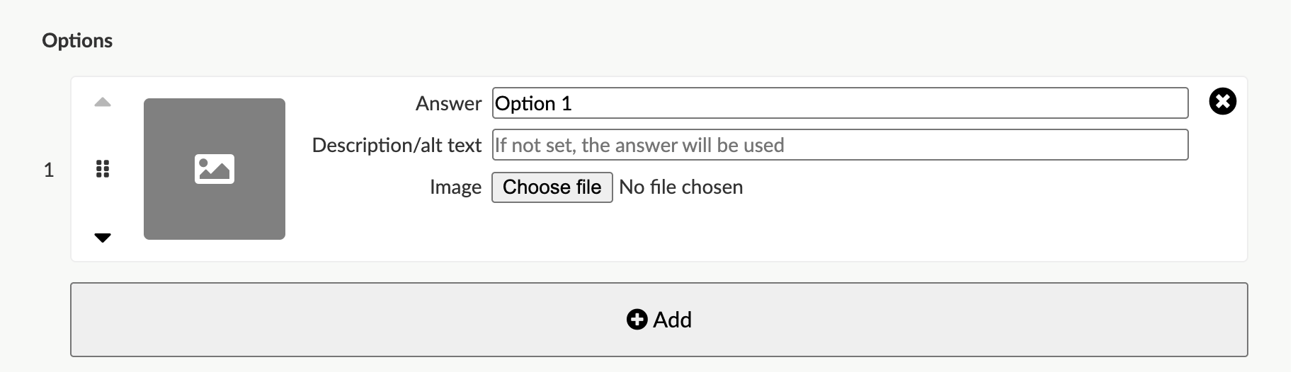
Options (answer text, descriptive text, image upload)
These are the answer options. For each answer option you'll need to set the answer text, description/alt text, and upload/choose the image. You can add up to 10 answer options.
Answer text
The value in the 'Answer' field is what is stored in the dataset and displayed throughout the reports and exports. These would be the same text answers that you would use for the question if you were using the regular radio buttons or checkboxes answer components (without images).
Description / alternative text
The description / alt text field should be use to describe the image.
It is an essential element of web accessibility: it can be read by screen readers giving people with visual or cognitive impairments a description and function of the image you’ve chosen. Find out more about writing alt text. You will have the choice in the Appearance section to decide if you wish to display the alt text or not.
Image (choose file)
Using the choose file button, you can either select or upload an image to be displayed as an answer option. The image files types permitted are either png or jpeg.
Note: The images are resized/shaped to be square and at most 400x400 pixels. This helps to reduce the overall file size and maintain consistent sizing for each image answer option across devices. For the least amount of resizing or shaping, we recommend uploading images that are already square and maximum 400x400px in size.
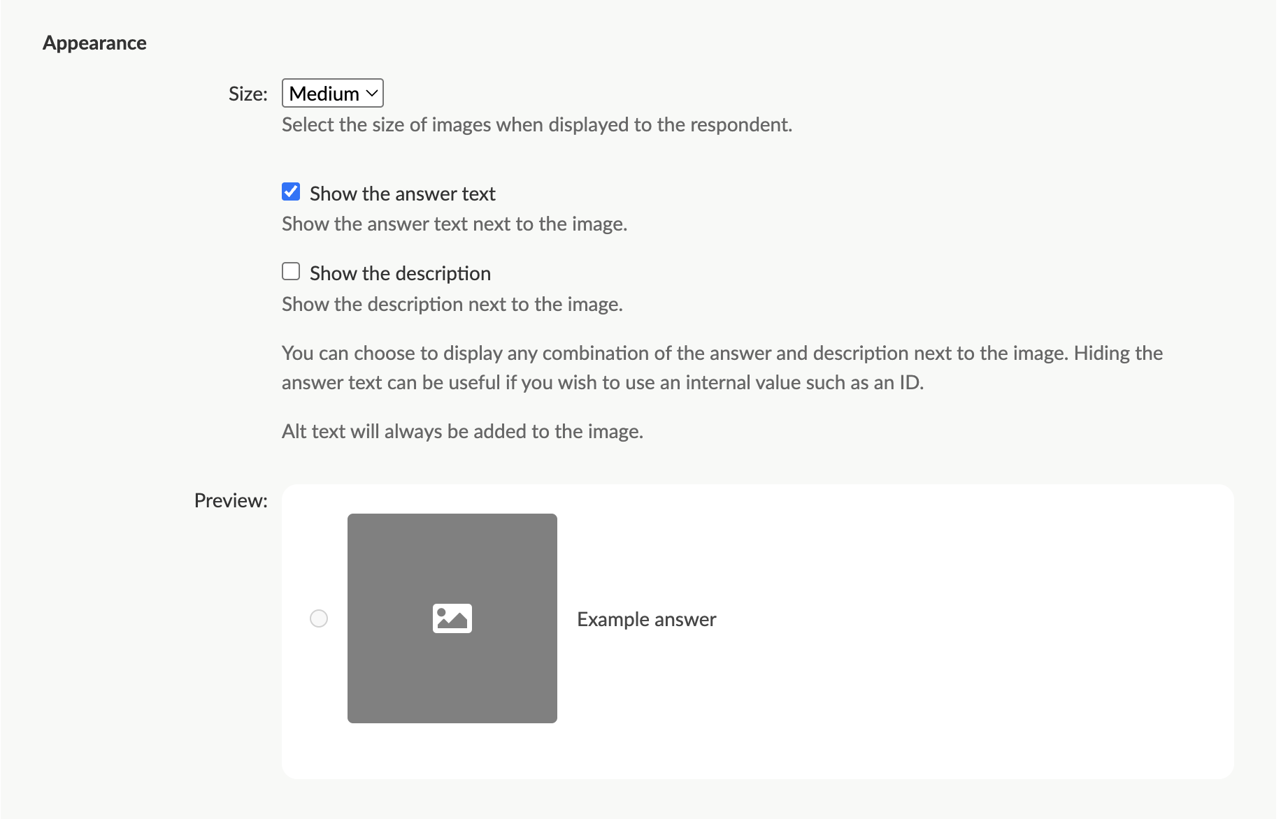
Appearance / display settings
Images can be selected to be displayed as small (100x100 px), medium (150x150 px), or large (250x250 px).
You can choose how you want the answers displayed:
- the image only (with no text visible next to the image)
- the image along with the answer text
- the image along with the alternative text description, or
- the image with the answer option text as well as the alternative text description.
Note: The preview is to show you how the size of the image will look relative to an example answer. It will not show your uploaded images or entered text.
Required option
If a component is marked as 'required', then the respondent must answer this question to proceed with the survey.
Reporting field heading
When exporting responses, this is used for your reference in the spreadsheet column headings.
Visibility
You can choose if the question is visible to respondents (default), or if it is to be used for reporting and analysis only. More information about analysis questions.
Reporting and analysis
When you look at an Image choice question in the responses by question page or in the summary reports, you will see a table and chart with a response breakdown for the answer options (no images will be displayed).
Response PDFs do however show the image.
Response publishing
You can use image as choice components to filter on the public 'view published responses' page.
The images do not show on the filter modal when published responses are shown on a map.